CUXBANK DIGITAL BANKING

PROJECT OVERVIEW
The Product
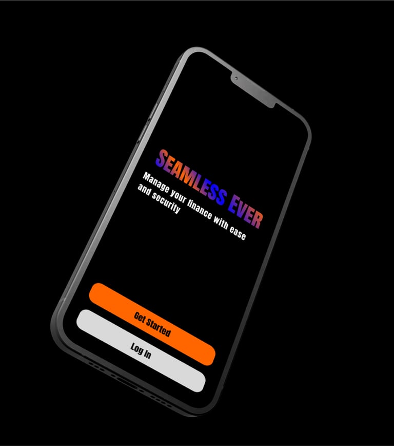
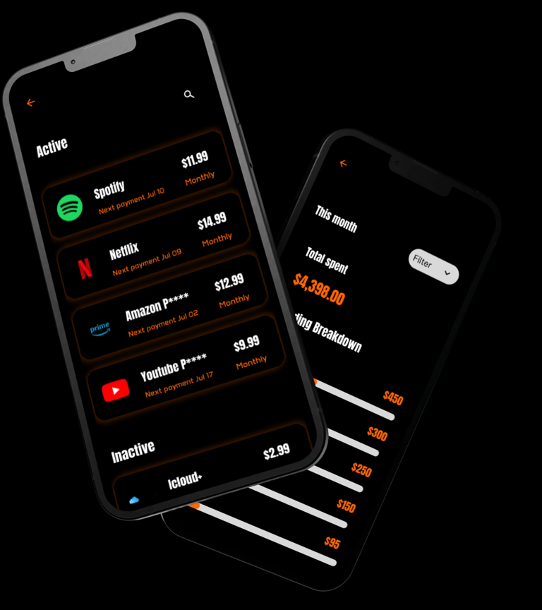
Cuxbank is a next-generation digital banking platform designed to provide customers with seamless, secure, and intelligent financial management. The product combines intuitive navigation, modern UI aesthetics, and personalized user experiences to help individuals manage their money with ease—anytime, anywhere.
Project Duration
1 Month : July 2025
In today’s fast-paced financial landscape, traditional banking platforms often fail to meet modern user expectations. Many digital banking apps suffer from cluttered interfaces, complex navigation, and inconsistent user flows, making essential tasks—like checking balances, transferring money, or tracking expenses—frustrating and time-consuming.
The Problem
The goal of the Cuxbank project was to design a secure, intuitive, and visually appealing digital banking experience that empowers users to manage their finances with confidence and ease.
We aimed to
Simplify core banking tasks such as account management, transfers, and bill payments.
Enhance trust through transparent design, consistent UI patterns, and clear security indicators.
Deliver personalized insights that help users make smarter financial decisions.
Ensure accessibility so the platform can be used effectively by a wide range of customers, regardless of their technical skill level.
The Goal
Role
As the UX/UI Designer for Cuxbank, I was responsible for shaping the entire digital banking experience from concept to high-fidelity design. My role combined user-centered research, interaction design, and visual interface creation to ensure the platform was both functional and aesthetically appealing.
Responsibilities
User Research & Analysis
Conducted competitive analysis of top digital banking apps.
UX Design & Information Architecture
Designed wireframes and low-fidelity prototypes for core banking flows (onboarding, transfers, dashboards).
Developed an intuitive information hierarchy and navigation system.
Focused on accessibility and usability to reduce friction for all users.
UI Design & Visual System
Crafted a consistent and modern visual language, including color schemes, typography, and iconography.
Designed interactive components, microinteractions, and responsive layouts.
Ensured the interface reinforced trust, clarity, and simplicity for end users.
User research : summary
We conduct foundational user research to go deeper finding the problem and pain point that let us to shape general idea about frustration needs & requirements to gain insights to realize our goals from this study.
There two types of user research methodologies : qualitative & quantitative research, we have conduct qualitative research method because we had a time constraint.
Sitemap
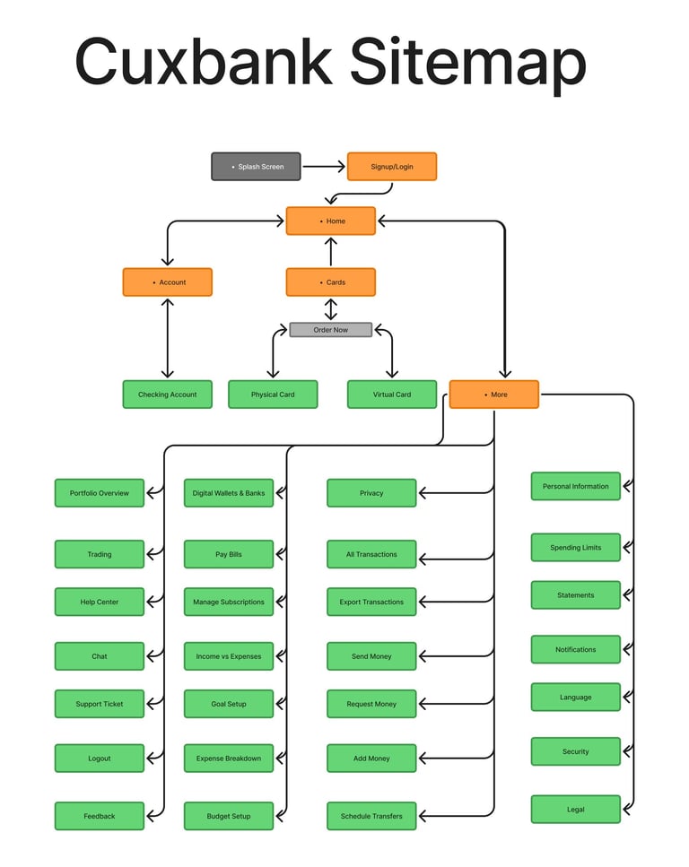
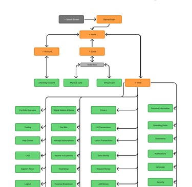
To view Large Visualisation of Sitemap View more
Here’s a portfolio-ready sitemap for your Cuxbank digital banking project. I’ll structure it as a clear hierarchy that you can include in your case study
Design System
Typography
We adopted a multi-font approach to create clear hierarchy and distinctive brand identity:
Inter – Primary font for body text, ensuring optimal legibility across devices.
Anton & Anton SC – Used for bold, impactful headings to grab attention.
Anta – Applied for labels and accent text to give a unique, modern character.
The font scale was designed to establish a clear visual rhythm, with defined styles for headings, subheadings, body text, captions, and microcopy.
Colors
Our color palette balances brand energy with functional clarity:
Neutral
Black & White


Primary
Orange


Secondary
Light Grey


Dark Grey


Status
Green


Red


UI Elements
The system includes a versatile library of UI components to ensure reusability and consistency across screens:
Labels & Buttons – Clear states for default, hover, active, and disabled.
Placeholders & Input Fields – Accessible forms with clear focus indicators.
Components – Cards, modals, and navigation bars aligned to the brand grid.
Blur Effects – Used subtly for overlays and depth in layered interfaces.
Flashcards – Informational or promotional highlights with concise text.
Dropdown Menus – Structured for quick selection and ease of navigation.
Lo-Fi Mockups


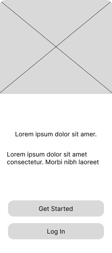


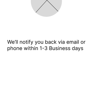
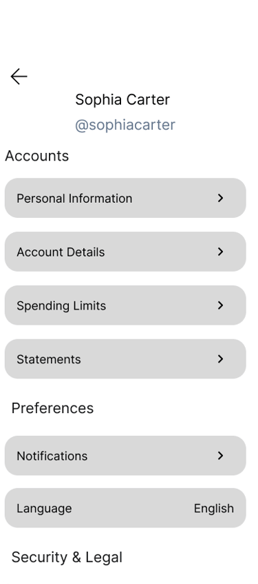
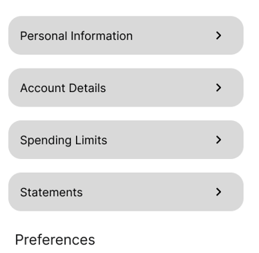
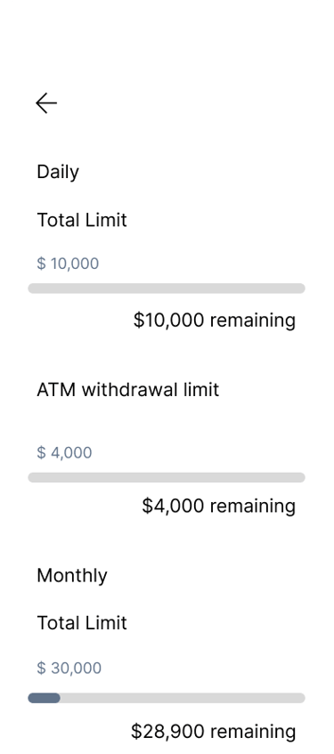
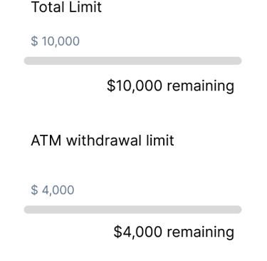
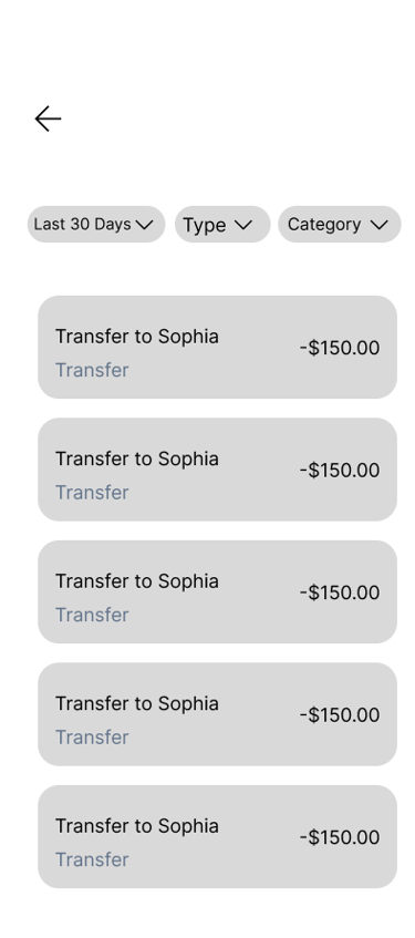
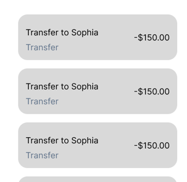
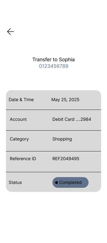
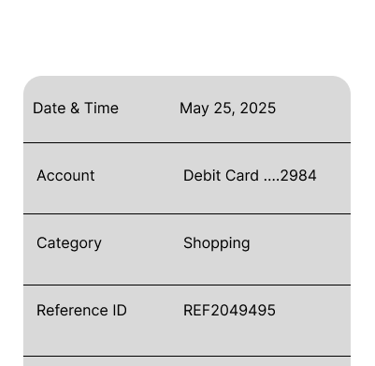

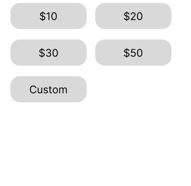
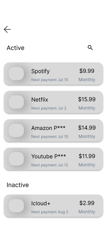
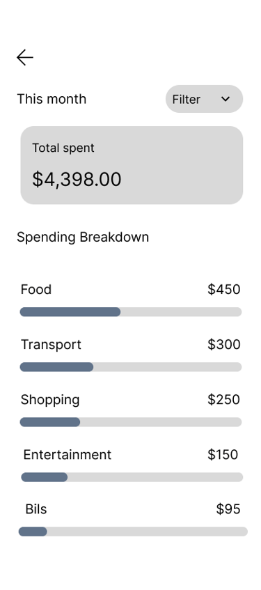
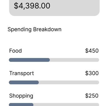
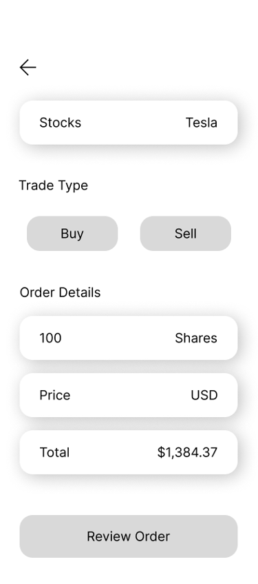
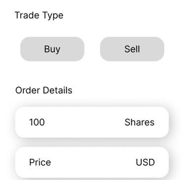
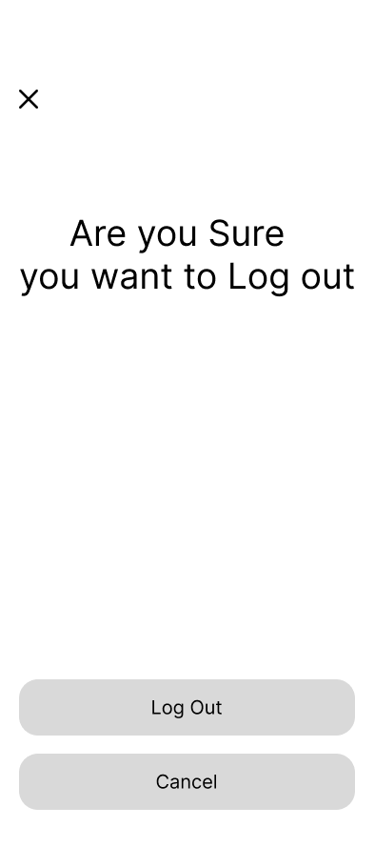


View All Low Fidelity Mockup Click here
Lo-Fi Prototyping
The low-fidelity prototype was developed as an interactive extension of our wireframes, enabling us to simulate core user flows and validate the app’s functionality early in the design process.
Hi-Fi Mockups
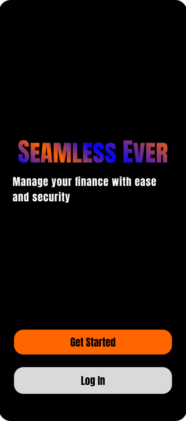
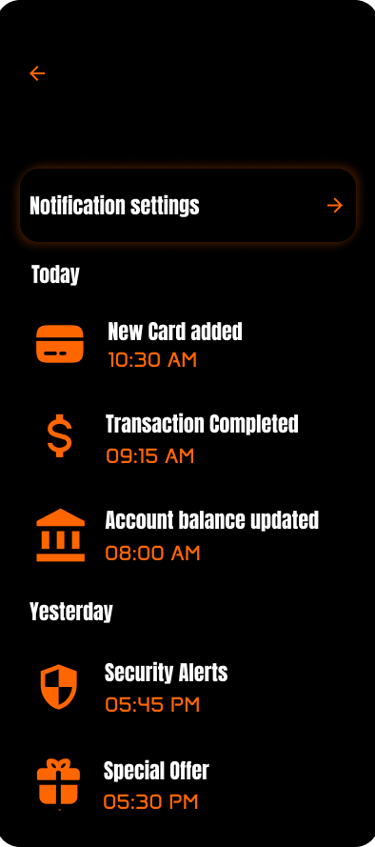
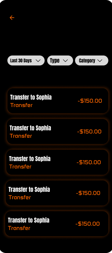
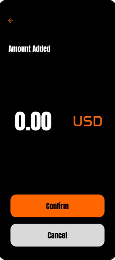
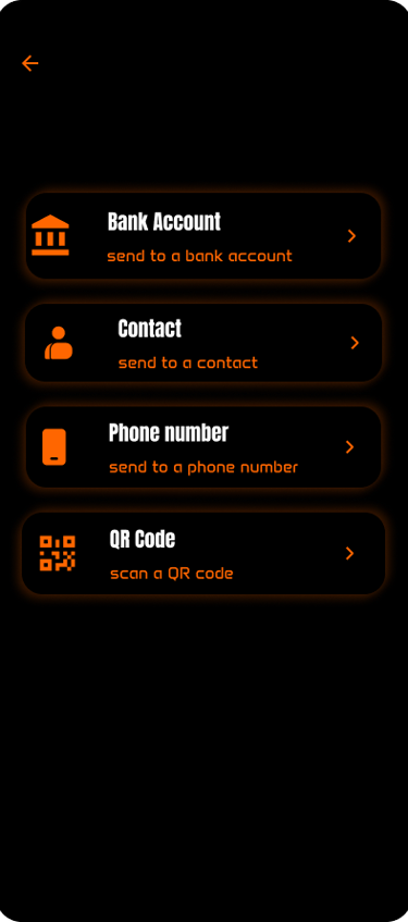
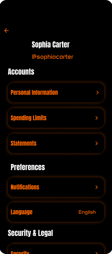
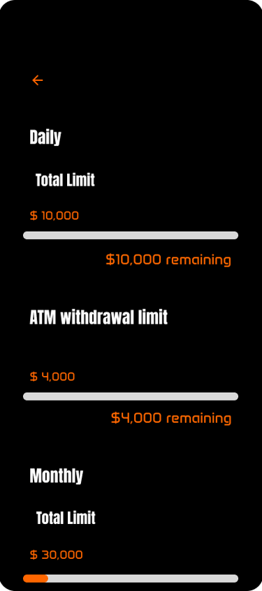
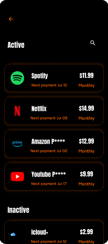
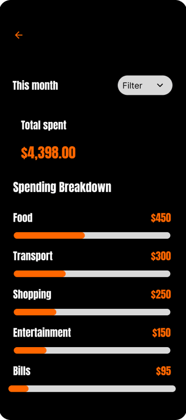
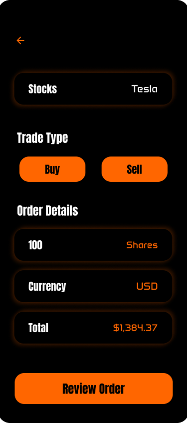
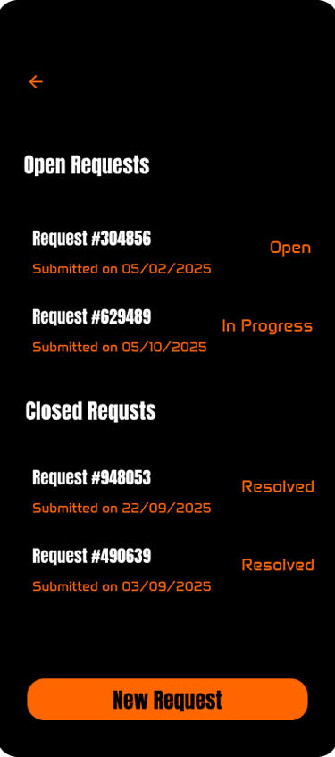
The high-fidelity mockups showcased the final visual direction of Cuxbank, integrating brand identity, polished UI components, and realistic content into the approved layouts. These mockups reflected exactly how the product would look and feel once developed.
Reach out our prototyping of user flows Low fidelity mockups Click here



















Hi-Fi Prototyping
The high-fidelity prototype represented the fully designed and branded version of the Cuxbank digital banking experience. It combined pixel-perfect UI elements, brand colors, and real content with interactive flows to closely mimic the final product.
The low-fidelity mockups for Cuxbank served as the first tangible translation of our ideas into visual form, focusing on structure, hierarchy, and user flows rather than visual styling.
view more click here
view more click here
view more click here
view all low fidelity mockups in figma click here
Reach out our prototyping of user flows Low fidelity mockups Click here
The Cuxbank project was a comprehensive journey through the end-to-end UX/UI design process, from initial research to final high-fidelity prototyping. By combining user-centered design principles with a strong, consistent visual identity, the result was a digital banking platform that is intuitive, secure, and visually engaging.
Through user research, we identified critical pain points in existing banking solutions and transformed them into opportunities for improvement. The iterative process of lo-fi mockups, prototypes, and usability testing allowed us to refine navigation flows, improve clarity, and ensure accessibility for all users.
The design system provided a scalable and cohesive foundation, ensuring every component—from typography to microinteractions—contributed to a seamless experience. The final high-fidelity designs demonstrated how Cuxbank could stand out in the competitive fintech landscape by delivering a humanized, modern, and efficient banking experience.
YASSINE ABOULKACEM
Got a partnership idea, or a project you need help with? Shoot me a line and let's talk.